Zoom Campus
Making online learning for students less stressful and messy.

Timeline
4 weeks
Team
Individual project
My Role
UX Research
UI Design
Interaction Prototyping
User Testing
Tools
Figma
Miro
Whimsical
Google Forms
ChatGPT
01
context
A multi-billion dollar market, and a platform that's winning it by accident
Total market opportunity
$908B
Global EdTech market projected value by 2034. Classroom-aware software is the highest margin layer Zoom can build on top of its existing video dominance.
300M+
Daily Zoom users
Already the default video platform in education, so new classroom features need zero new downloads.
90%
K-12 keeping hybrid learning
Growing as structural policy, not a pandemic hangover.
62%
Students want something simpler
Despite Zoom's dominance, trust in the classroom experience is still missing.
who are we designing for?
k-12 students
~1.6B
Ages 5–18, digital natives who expect consumer-grade experiences. Zoom fatigue and fear of public mistakes keep cameras off and questions unasked.
teachers and educators
~94M
Deliver daily instruction across 30–50 student classes. Lose hours weekly to platform switching and manual parent communication.
school admins & it
~10M
Select and maintain edtech infrastructure. Can't prove active engagement for funding audits, only login times.
02
The problem
Showing up isn't the problem. Being supported once they're there is.
Zoom was built for professional meetings, not for learning. The result is passive, fragmented and socially hollow sessions that actively work against student engagement. The data shows exactly where it breaks down.
62%
of students say they'd rather use something simpler than Zoom
80%
say staying focused is their number one challenge once in class
90%
would use a unified student experience app if it existed
2.3/5
how connected the students feel to their classmates
Data collected via a survey of 20 students across six countries, exploring their experiences with online video-based learning.
03
hypothesis
“If Zoom made student understanding visible during class, not just discovered after grades drop, teachers could intervene before disengagement becomes failure.”
04
The strategy shift
BEFORE - REACTIVE SYSTEM

No comprehension signal
Grades drop before anyone notices
Questions expose you to class
Assignments scattered across 4+ tools
Attendance = manual reports only
Engagement invisible until it's too late
AFTER - ANTICIPATORY SYSTEM

Attention Pulse surfaces understanding
Anonymous Q&A removes social cost
Smart Join removes friction
The Hub unifies recordings, notes, homework
Teachers see engagement, not guesswork
Zoom becomes a classroom tool, not a meeting tool
05
solution
One system. Every touchpoint in the online classroom.


Low fidelity wireframes
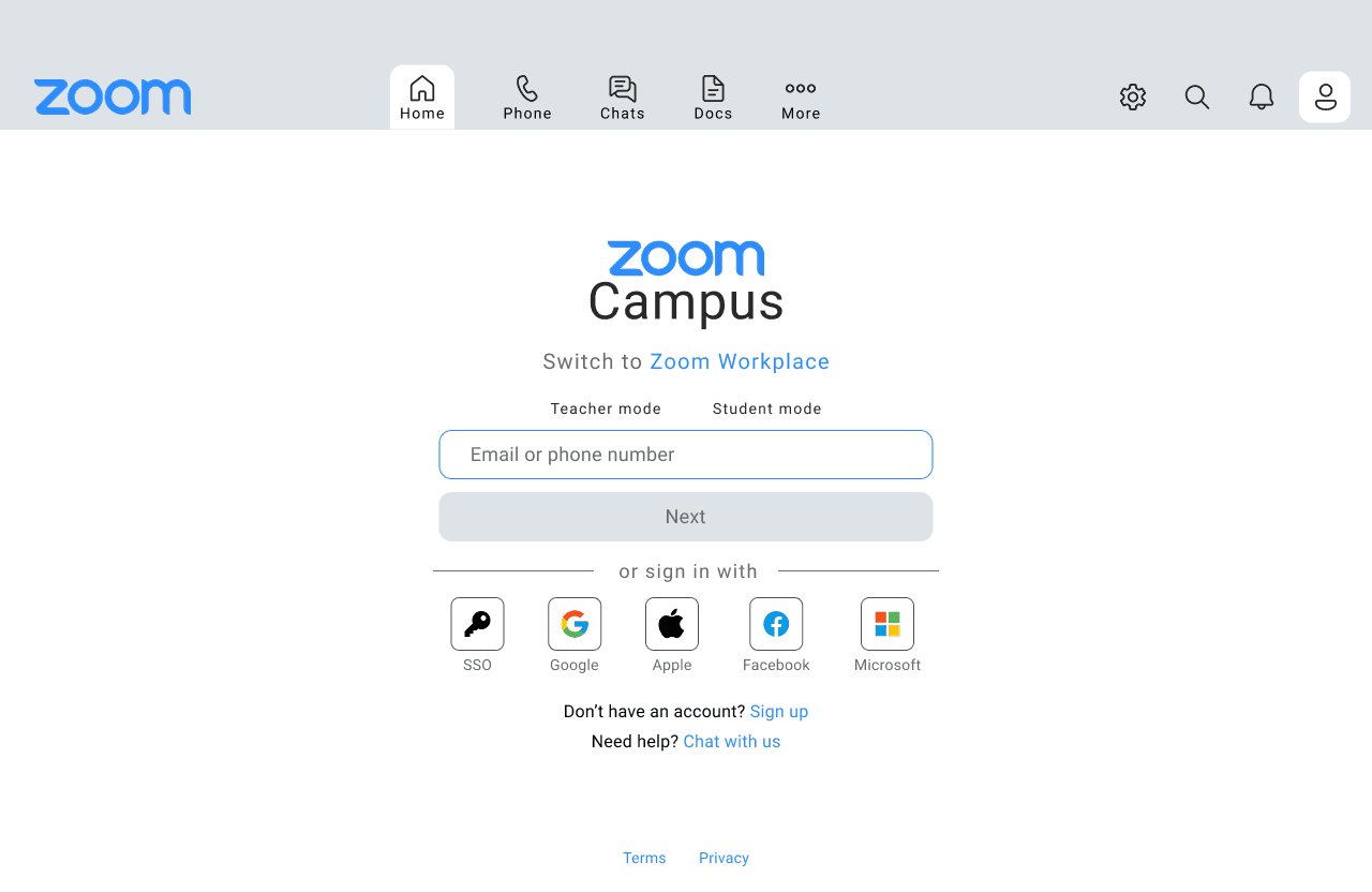
Join class without hunting for a link
Teacher mode and Student mode are split right at login, so everyone lands on the screen built for their role before they even reach the dashboard.


One tap into class, right from the dashboard
Every scheduled class carries its own direct Join now button next to its time, solving the 4.0/5 friction point before the lesson even starts.

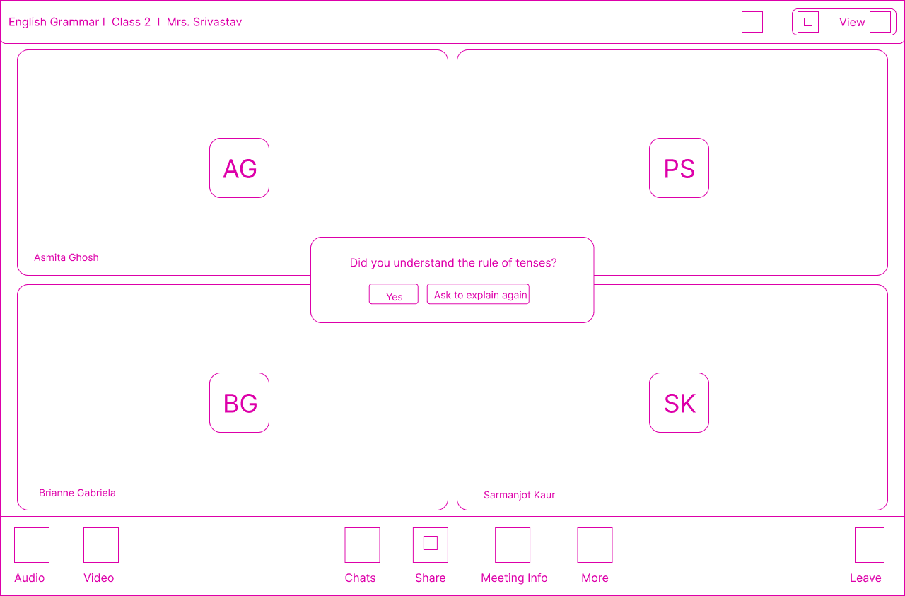
A quiet comprehension check, mid-class
A plain-language prompt appears over the meeting grid so a student can flag confusion with one tap, Yes or Ask to explain again, without saying a word out loud.

Ask without exposing yourself to the class
Named and anonymous questions sit side by side in the same thread, with a simple toggle to switch identity right before sending, removing the social cost of admitting confusion in front of 30 classmates.

Every recording and assignment, in one place
Recordings are organized by subject and teacher, and assignments are listed with subject and due date side by side, so nothing lives in a separate tool anymore.

06
key learnings
01
The reframe came before the concept, not after.
Calling this an "engagement problem" leads to gamification and badges. Calling it a "visibility problem" leads to Attention Pulse and Anonymous Q&A. The frame you choose decides which product you build.
02
The smallest number carried the most signal.
Students didn't ask for more features. They asked to feel less alone. 2.3 out of 5 was the quietest, loudest number in the whole survey.
03
Good scope is a creative decision, not a limitation.
It would have been easy to redesign all of Zoom for education. Designing only the moment of confusion, Pulse, Q&A, one panel, forced depth over breadth.
04
Teachers get zero learning curve. Students get an entirely different experience.
Every new feature lives inside Zoom's existing sidebar and UI patterns instead of introducing a new surface. Familiar shell, different experience underneath.
Glad we could cross paths!
I hope it left you with a bit of curiosity and inspiration.
SELECTED WORK
© 2026 Arunima Guin. All rights reserved.